接上面,再补充一些简单图形,利用css3的before和after伪类可以,其实最重要的是思想,不要为实现方式纠结,本人的实现方式肯定是很差的。
上网搜了下别人的实现,发现刚刚弄的几个DEMO完全是弱爆了,先抛开效果不说,就说那个爱心,别人只用一个DIV就搞定了,根本不需要什么拼装。这也是得益于CSS的伪类 :before,:after.
这两个伪类以前也用过,经常是需要在前面或后面插入一段文字的时候用到,如果用来绘图就再牛B不过了,一个DIV可以有三个绘制的区域,每个绘制的区域又可以绘制出任意角度的三角,梯形,及其它圆圈等形状,理论上上次说的除了那个匕首图形外,其它的都可以用一个DIV搞定了。这里先看一段再简单不过的代码
    .test{
        color: #ffffff;
        background-color:green;
        width: 60px;
        height: 20px;
        line-height: 20px;
        margin-left: 40px;
        margin-top: 20px;
    }
    .test:before{
        background-color: red;
        width: 20px;
        height: 20px;
        line-height: 20px;
        display: block;
        margin-left: -20px;
        content: "before";
        overflow: hidden;
        position:absolute;
    }
    .test:after{
        background-color:blue;
        width: 40px;
        height: 20px;
        line-height: 20px;
        display: block;
        content: "after";
        overflow: hidden;
        position:absolute;
        margin-left: 60px;
        margin-top: -20px;
    }
结果及原理图如下。:before和:after里面一定得加入position:absolute;这样才能准确定位
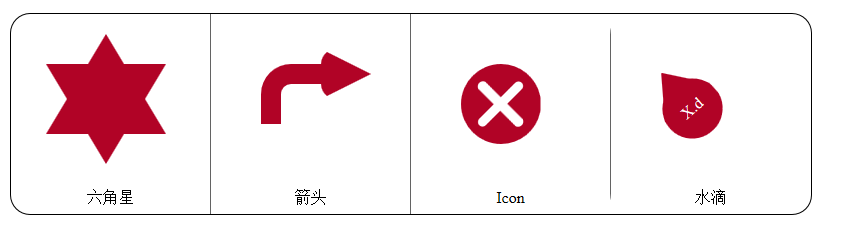
OK,了解了原理,就再来几个小DEMO小试牛刀。直接贴代码
还是先把没用的HTML先粘上
<html>
<head>
<meta charset="utf-8" />
<title>css3 simple graph2</title>
</head>
<body>
    <div class="container">
        <div class="show">
            <div class="draw">
                <div class="liujiaoxing"></div>
            </div>
            <div class="text">六角星</div>
        </div>
        <div class="show">
            <div class="draw">
                <div class="jiantou"></div>
            </div>
            <div class="text">箭头</div>
        </div>
        <div class="show">
            <div class="draw">
                <div class="icon"></div>
            </div>
            <div class="text">Icon</div>
        </div>
        <div class="show">
            <div class="draw">
                <div class="shuidi"></div>
            </div>
            <div class="text">水滴</div>
        </div>
    </div>
</body>
</html>
然后是我的主力CSS了
/**
* 先说明一下,本人是在IE上调试,因为更符合CSS3的风格,不用加什么前缀,也懒得多写重复的东西,也好看点。
* 如果在FireFox,Chrome,Opea等浏览器上使用,自行在CSS3的样式名前面加上-webkit-,-moz-,-o-等。
*/
.container{
    width: 800px;
    height: 200px;
    border: 1px solid #000;
    margin: 0 auto;
    border-radius: 20px;
    column-count:4;
    column-gap:0px;
    column-rule:1px outset #000000;
    margin-top: 20px;
}
.container .show{
    width: 200px;
    height: 200px;
    overflow: hidden;
    border-radius: 20px;
}
.container .show .draw{
    width: 200px;
    height: 170px;
    display: inline-block;
    transition:all 2s;
}
.container .show .text{
    width: 200px;
    height: 30px;
    line-height: 28px;
    text-align: center;
}
.draw:hover{
    transform: rotate(360deg);
}
/**
* 一个DIV可以画一个,两个,三个三角形,要是都叠在一起,看到的当然就是一个三角形,但如果第二个三角形刚好旋转个90度什么的,看起来就是六角形了
* 这里的三角形的边不能以白色做背景了,因为会档到,一定要用透明属性border: transparent;
*/
.liujiaoxing {
    margin-left: 35px;
    margin-top: 20px;
    width: 0;
    height: 0;
    border-left: 60px solid transparent;
    border-right: 60px solid transparent;
    border-bottom: 100px solid #B10326;
    position: relative;
}

.liujiaoxing:before {
    width: 0;
    height: 0;
    border-left: 60px solid transparent;
    border-right: 60px solid transparent;
    border-bottom: 100px solid #B10326;
    position: absolute;
    content: '';
    left: -60px;
    top:30px;
    /**
    * 当然,这里用个反方向的三角形也可以,就免得写旋转的样式了。三个可算定的三角形通过叠加可以搭出的形状很多很多,看到CSS3不是给人看一下而已的,研究的高深了还是不一样。
    */
    transform: rotate(180deg);
}

/**
*箭头也相当简单,就是一条线加一个三角形,没什么技术含量,如果想绘一个看起来有点弯的箭头呢
*/
.jiantou{
    margin-top: 50px;
    margin-left: 50px;
    content:'';
    width:40px;
    height:40px;
    display:block;
    position:absolute;
    /*
    *弯的话,就只能借用圆角了,目前好想没想到绝对的曲线,方法还是用border,这里给一个透明的区域上加两条边,用两条边再加一个圆角让这条“线”看起来有点幅度。
    */
    border-top-left-radius: 30px;
    border-left:20px solid #B10326;
    border-top: 20px solid #B10326;
}
.jiantou:after{
    content:'';
    height:0px;
    width:0px;
    position:absolute;
    display:block;
    border-top:25px solid transparent;
    border-left:50px solid #B10326;
    border-bottom: 25px solid transparent;
    border-radius:15px 0 0 15px;
    margin-top:-35px;
    margin-left:40px;
    /**
    *其实发现这个方法也可以用来绘饼图,比上次做的那个要强
    */
}

/**
*发现这个特性特别适合绘ICON,秒杀图片式的古老ICON,这里简单起划一个停止ICON
*/
.icon{
    margin-top: 50px;
    margin-left: 50px;
    height:80px;
    width:80px;
    border-radius:50% 50%;
    background:#B10326;
}
.icon:before, .icon:after{
    content:'';
    /**
    * 如果是中间有字,一个X就可以搞定的,这里自己画一个
    */
    height:10px;
    width:60px;
    display:block;
    background:#fff;
    border-radius:10px;
    position:absolute;
    margin-top:35px;
    margin-left:10px;
    transform:rotate(-45deg);
}
.icon:after{
    transform:rotate(45deg);
}
/**
*继续画一个水滴效果,看起来很复杂,但把水滴一拆,上面的酷似三角形,下面就是一个半圆,结论就有了,下面是一个整圆,上面的三角形和下面的半圆重合了。
*这里我想在水滴里面写点字,利用伪类里面的content属性,先试试吧
*/
.shuidi{
    height:80px;
    width:60px;
    margin-top: 30px;
    margin-left: 50px;
    display:block;
    position:relative;
}
.shuidi:before{
    content:'X.d';
    height:60px;
    width:60px;
    display:block;
    position:absolute;
    top:20px;
    left:0px;
    z-index:1;
    line-height:60px;
    background:#B10326;
    border-radius:50% 50%;
    color:#fff;
    text-align:center;
}
.shuidi:after{
    content:'';
    height:0px;
    width:0px;
    display:block;
    margin-top:3px;
    position:absolute;
    border-bottom: 40px solid #B10326;
    border-left: 30px solid transparent;
    border-right: 30px solid transparent;
}
/**
* 发现画的太不象了,也懒得调,数学学不好悲剧啊。可能圆小点,三角长点可能看起来就更像了吧,有兴趣可以自已去修复。
* OK,对于使用样式作图,就先研究到这了,大致学了思想后,自己动手画一两个,掌握一些知识就行了,如果想学专业点,就多练习吧。
**/
最后上我威武强大的效果图